Find out where you can watch Match Me If You Can this weekend. We have just the list for you. It includes our select theaters and all the On Demand Platforms. ... Read More
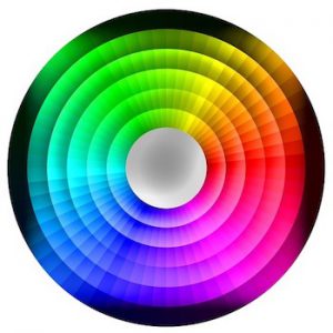
Color Color Everywhere – Color Theory
So in the last few Vlogs I talked about color theory and color mapping. You might be wondering what exactly that is. I’ll try my best to explain it, at least to my understanding, in the simplest way. (But please know I’m not an expert in this subject, this is just my opinion based on this wonderful experience I am having right now.)
To continue…
In most mediums, color is used to create meaning and emotion, which in turn communicates information to the audience. In other words, color conveys the creator’s vision. In film, that would be the director’s vision. Now, not every film has a specific color theory, and it doesn’t make or break a film. But what I have found in my viewing of movies is when color has been considered and thought out, the film makes more of an impact on me emotionally.
There are different ways to present color. It can be over saturated like Pushing Daisies and Moulin Rouge, or it can be desaturated like in Road to Perdition or Up in the Air. Or it can be a combination of the two. On top of that, the way color comes into play can be different. The overall scene could have specific lighting scheme leading towards a particular color such as blue or green or be color corrected towards a certain color and in varying extremes. Many TV procedurals do this nowadays. Also, you can keep a scene fairly neutral or natural but have specific color brought in with a colored prop, wardrobe, and/or set dressing. These are just a few ways color can be used. It’s all very fascinating! But the most important thing to remember about color, or the lack of color, is it affects all of us on some level.
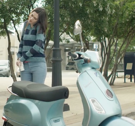
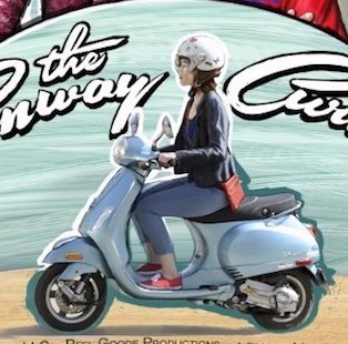
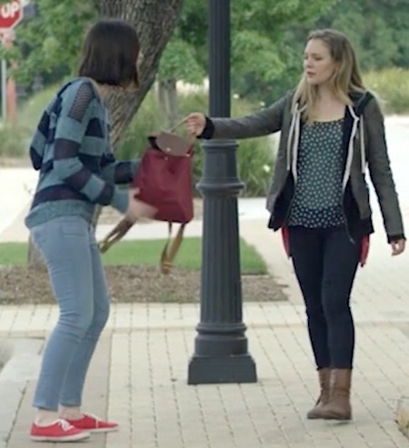
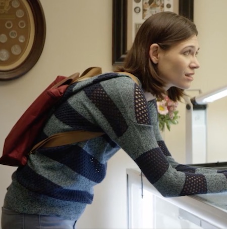
There are theories out there that say that each color has a specific meaning we all somehow know, which I don’t completely buy into. I feel as a director you have a chance to take any color you like and through the use of placement and situation you can create specific meaning to that color. But I do believe color holds a certain amount of feeling that you have to take into consideration. In the end, it’s your vision and it’s your world we as viewers are visiting. You tell us what your colors mean. Red may mean death in The Sixth Sense and passion and jealousy in Moulin Rouge. For The Conway Curve, I always describe the film as being light, fun, bright, and absurd. What colors come to mind when you hear these descriptive words? For me, I think light = pale blues, pale reds, and pale greens (desaturated), bright = yellow like a sunny day, and fun and absurd = saturated colors like deep purples, reds, and greens that really call attention to themselves. Is this our color pallet? Not completely. But it’s a good place to start!
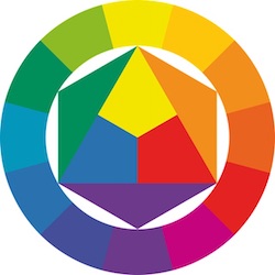
In the past few weeks, I have studied the color wheel and thought of all the different choices it provides me. I have also watched many films with varying color theory.
Did I want to use only cool colors in our film, or only warm colors, or only complimentary colors? Saturated? Over-Saturated? Desaturated? I had a lot to think about, because with each direction came a slightly different feel and look. Through the first breakdown of the script I kept thinking: what is Natalie’s favorite color? What is Luke’s (Natalie’s Con Artist brother)? And what does that color say about them? Is that color associated with certain ideas or object? What do I want to say about those characters? When that first simple question what is Natalie’s favorite color was answered…I had my direction.
Here’s an example of how my thought process went. Red is Natalie’s favorite color. But red is a bold and strong color and Natalie isn’t. So I could have her wearing it at the beginning of the film as her security blanket or wearing it like a mask of what she wants to be. But I didn’t like that.
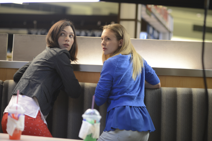
I obviously love color theory and could talk for pages about it! I hope you are inspired to look more deeply into it and keep your eyes peeled. Color is an incredible tool for filmmakers at all levels, but especially for us no to low budget filmmakers. It’s a low cost way to add value to your visuals and add layers of depth to your story, which ultimately makes you a better storyteller. When you think about color in relation to your characters, you think about your character in a deeper way.
~Marian

